A website offering blended learning courses was starting to look “dated.” That’s when we decided to create a mock-up
approach to propose a redesign.
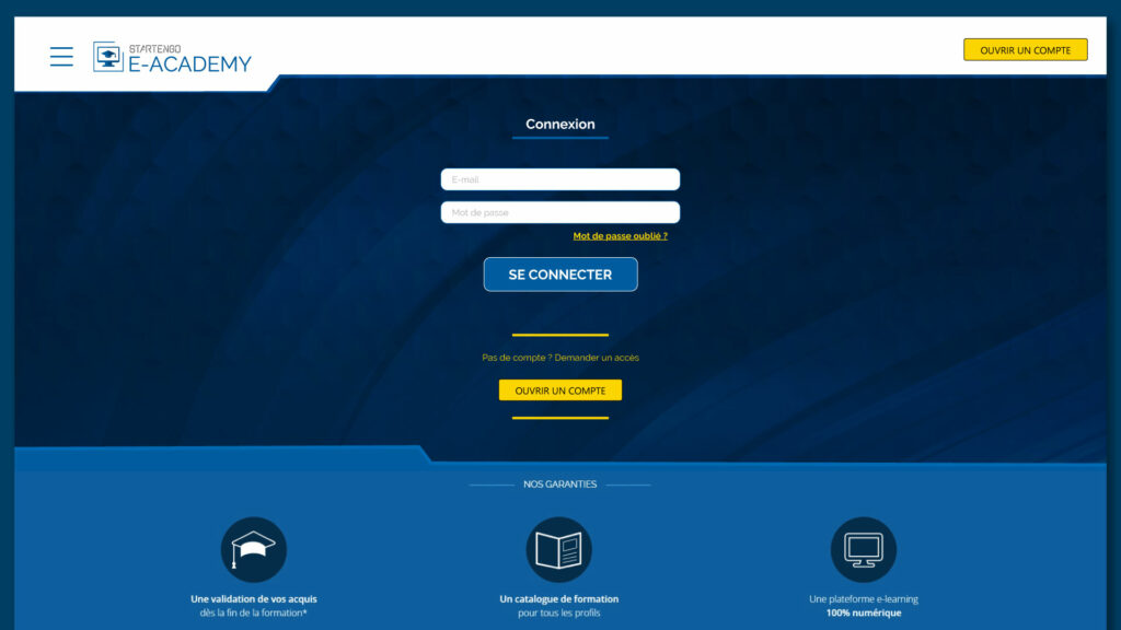
For the Startengo E-Academy login page redesign, I focused on usability and modern aesthetics.
Sleeker UI with a dark blue gradient background and subtle geometric texture.
Better readability with white input fields and clear placeholders.
Enhanced CTAs, making the login and sign-up buttons more visible with bold blue and yellow.
User-friendly guidance, including a clear password recovery link.
Structured benefits section with icons for clarity on certification, course catalog, and digital learning.
The result: a more intuitive and visually appealing login experience.
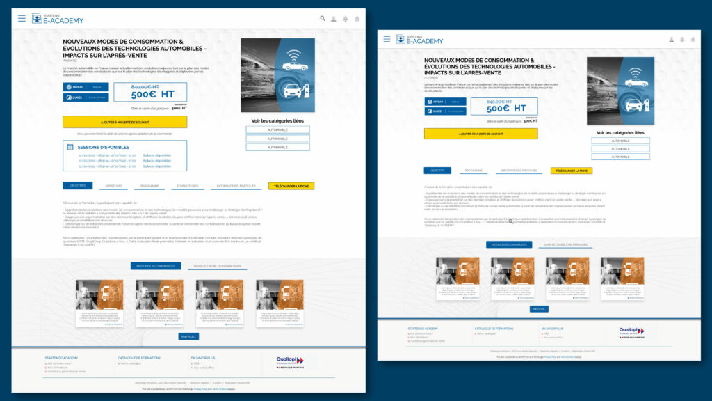
For the Startengo E-Academy product page redesign, I focused on clarity, hierarchy, and modern aesthetics.
Refined layout with better spacing for readability and a more balanced structure.
Pricing visibility improved with clearer contrast and a structured display.
More engaging call-to-actions with prominent buttons for wishlist and brochure download.
Optimized information tabs for objectives, program, and additional details.
Streamlined module recommendations with a cleaner design for a professional look.
The result: a more intuitive, visually appealing, and user-friendly product page.
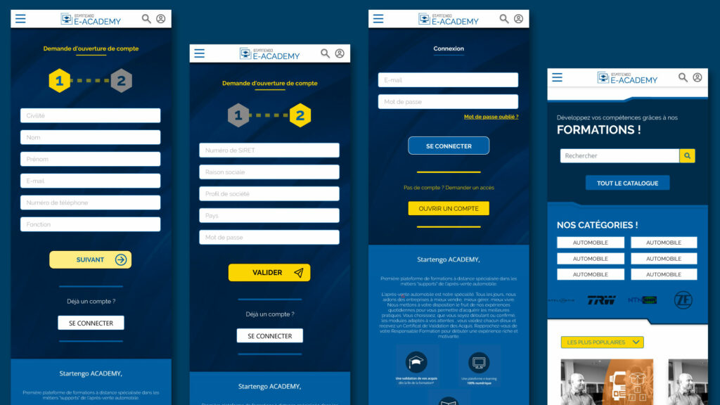
The initial responsive design of Startengo E-Academy lacked consistency, with misaligned elements and poor spacing making navigation difficult. Typography was not optimized, causing readability issues due to text being either too small or poorly spaced. Buttons and interactive elements were inconsistently styled, leading to confusion about primary actions and requiring unnecessary scrolling. The redesign improved spacing, alignment, and touch-friendly interactions while enhancing readability and ensuring a smooth adaptation across different screen sizes.